Learn how to choose the right web design company in 2026. Avoid costly mistakes, improve conversions, and hire a team that builds websites that grow your business.

How to Choose the Right Web Design Company in 2026

Most businesses don’t fail online because they have bad products. They fail because the web design company they choose doesn’t clearly communicate what they do in the first five seconds.

I’ve worked with dozens of businesses that spent $10,000 to $50,000 on beautiful websites that didn’t generate a single lead. The design looked professional. The colors matched the brand. But the website didn’t solve the real problem: turning visitors into customers.

After reviewing hundreds of websites and working directly with business owners across the USA, UK, Canada, and Australia, I’ve noticed something important. The biggest mistakes don’t happen during the design phase. They happen when choosing who builds your website.

This guide will help you make a decision you won’t regret six months later.

Why Choosing Wrong Costs More Than You Think

When you hire the wrong web design company, the real cost isn’t just the money you paid upfront.

Here’s what actually happens:

You lose leads every single day. A confusing website turns away potential customers. While you wait for a redesign, your competitors are capturing those leads.

You waste months of time. Explaining your business again. Going through another discovery phase. Waiting for another launch.

You damage trust. When customers land on a poorly built website, they question whether your business is professional.

You pay twice. The average business redesigns their website every 2-3 years. Not because of new trends, but because the first version never worked properly.

I’ve seen a consulting firm lose $30,000 in potential revenue because their website loaded slowly and didn’t explain their services clearly. The agency they hired focused on winning design awards, not generating business results.

The pattern is always the same: businesses hire based on pretty portfolios without asking the right questions.

What "Right" Actually Means

Before you start comparing agencies, you need clarity on what you actually need.

Most businesses confuse website goals with design preferences. They say things like “I want it modern” or “I like blue.” But that’s not strategy.

Ask yourself three questions:

  1. Who is this website for?

 Be specific. “Small business owners in healthcare” is better than “everyone.”

  1. What action should visitors take?

 Do you want them to book a call, request a quote, make a purchase, or download something?

  1. How will you measure success?

 Is it more inquiries, lower bounce rate, higher sales, or better brand perception?

Different goals require different approaches. An ecommerce store needs different functionality than a service business portfolio. A B2B company needs different messaging than a local restaurant.

Define this before you talk to any agency. It will save you from wasting time on irrelevant proposals.

Design Is About More Than Looking Good

Here’s something most people don’t realize: a beautiful website that confuses visitors is worse than a simple website that converts.

I once compared two websites in the same industry. One had stunning animations, award-winning design, and cost $40,000. The other was clean, simple, and cost $8,000. The simple one generated three times more leads.

Why? Because good design isn’t just visual. It’s about:

Clarity. Can visitors understand what you do in 5 seconds?

Navigation. Can they find what they need in 2 clicks?

Mobile experience. Does it work perfectly on phones? Over 60% of web traffic comes from mobile devices.

Speed. Does it load in under 3 seconds? Slow websites lose half their visitors.

Conversion focus. Does every page guide visitors toward taking action?

When reviewing potential web design companies, don’t just look at how their portfolio looks. Ask how those websites performed. Ask about conversion rates, user feedback, and business results.

SEO and Performance Must Be Built In From Day One

Here’s a costly mistake: treating SEO as something you “add later.”

By 2026, Google’s algorithm has become incredibly sophisticated. It evaluates:

  • Page loading speed
  • Mobile responsiveness
  • Content structure
  • User experience signals
  • Technical foundation

If your website isn’t built with these factors in mind from the start, you’re starting behind your competitors.

I’ve seen businesses launch beautiful websites that never appeared in Google search results. Why? The agency didn’t optimize images, ignored meta descriptions, used poor heading structure, and didn’t submit the sitemap properly.

Ask any potential web design company: “How do you approach SEO during the design phase?” If they say “We can add that later” or “That’s separate,” find someone else.

Your website should be technically sound and SEO-ready from launch day.

Portfolio vs Case Studies: What Actually Matters

Most agencies show you screenshots of pretty websites. That tells you almost nothing.

What you should ask for: case studies with actual results.

A real case study explains:

The problem. What challenge did the client face?

The solution. What approach did the agency take?

The outcome. What results did the website achieve? More traffic? Higher conversions? Better user engagement?

When an agency can’t provide specific results, they’re probably focused on aesthetics over performance.

One agency I evaluated showed a beautiful portfolio but couldn’t name a single metric from any project. Another agency had simpler designs but showed me how they increased a client’s leads by 140% in six months.

Guess which one actually understands business?

Red Flags Most Businesses Ignore

Watch for these warning signs:

Prices that seem too good to be true. Quality development takes time. Someone charging $1,500 for a custom website is either inexperienced or using cheap templates.

No written contract or documentation. Professional companies provide detailed proposals, timelines, deliverables, and payment terms.

No post-launch support plan. Websites need updates, security patches, and occasional fixes. Who handles this after launch?

They don’t ask questions about your business. If they jump straight to colors and layouts without understanding your goals, they don’t care about your results.

Vague answers about process. “We’ll figure it out as we go” is not a strategy.

No analytics or tracking plan. If they don’t discuss how you’ll measure success, they’re not thinking about performance.

They promise #1 Google rankings. No one can guarantee specific rankings. Google’s algorithm has over 200 factors.

Trust your instincts. If something feels off during initial conversations, it usually is.

How We Approach Web Design at Oriental Outsourcing

At Oriental Outsourcing, we start every project with a business audit, not a design meeting.

Our first questions aren’t about colors or layouts. We ask about your business model, target customers, competitors, and revenue goals.

Why? Because a website is a business tool, not an art project.

Our process focuses on understanding your market before we design a single page. We map customer journeys, analyze competitor strategies, and identify conversion opportunities.

We’re not right for everyone. If you need the absolute cheapest option or want to control every pixel, we’re probably not a good fit.

We work with businesses that see their website as an investment in growth, not just an expense to check off a list.

Making Your Decision

Choosing a web design company isn’t about finding the biggest name or the lowest price.

It’s about finding a partner who understands your business goals, communicates clearly, delivers on promises, and supports you after launch.

Take your time with this decision. A rushed choice now means another redesign in 18 months.

Ask hard questions. Check references. Trust your judgment.

Your website is often the first impression potential customers have of your business. Make it count.

Need clarity before making a decision? A simple website audit can reveal what’s working, what’s not, and what you actually need before you commit to any contract.

Visit  to learn how we help businesses make smarter web design investments.

Add Your Heading Text Here

How do I know if a web design company is right for my business?

The right web design company focuses on your business goals, not just how the website looks.

They should ask questions about:

  • Your target customers

  • What action you want visitors to take

  • How success will be measured (leads, sales, inquiries)

If a company jumps straight to colors, layouts, or trends without understanding your business, they’re not the right fit.

Website costs depend on complexity, not just design.

Typical ranges in 2026:

  • Simple business website: $3,000–$8,000

  • Conversion-focused service website: $8,000–$20,000

  • Complex or custom platforms: $20,000+

Very cheap websites often use templates, skip SEO, and fail to generate results—leading to costly redesigns later.

Yes—SEO should be built in from day one.

A professional web design company considers:

  • Page speed and performance

  • Mobile responsiveness

  • Proper heading structure

  • Clean code and technical SEO

  • Search-friendly content layout

If SEO is treated as “something to add later,” your website will struggle to rank, no matter how good it looks.

Case studies matter more than portfolios.

A portfolio shows how a website looks.
A case study shows:

  • The problem the client had

  • The strategy used

  • The results achieved (leads, traffic, conversions)

Always ask for real results. A beautiful website without performance data tells you very little.

Common warning signs include:

  • Prices that seem too good to be true

  • No clear process or timeline

  • No discussion about conversions or SEO

  • No ownership rights after launch

  • Promises of guaranteed Google rankings

A trustworthy web design company is transparent, realistic, and focused on long-term results—not quick sales.

Website Best font

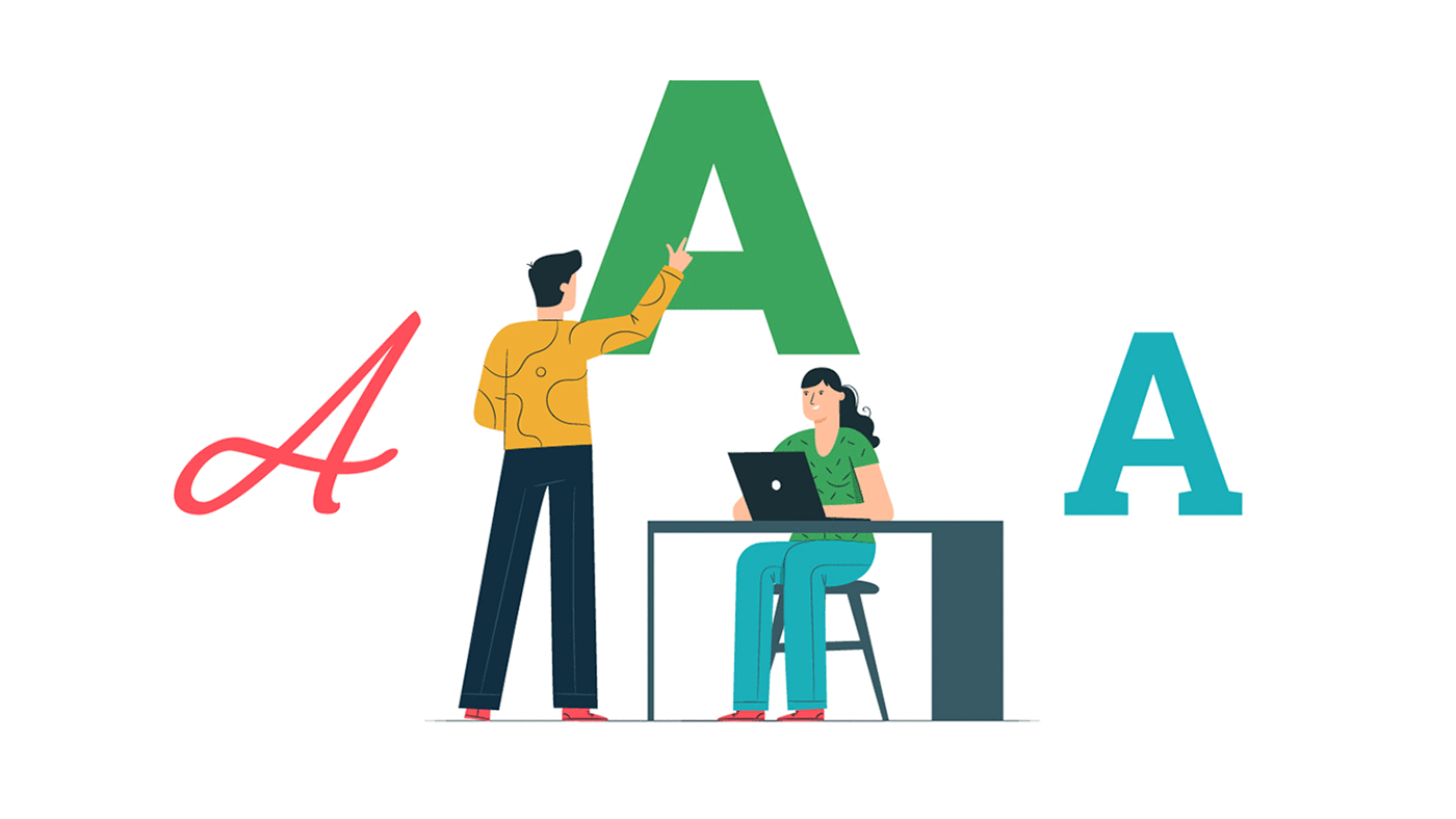
How To Pick the Website’s Best Fonts

When creating a website, we must be very careful about every tiny detail. Taking care of these tiny bits of detailing help us in an explicit way. The explicit detailing of important things like fonts makes us stand away from the crowd. Whatever may be the purpose of the website, the idea should be conveyed to the user in a clear, distinct manner. Visual representation of the website holds great importance for all the users. We must try to convey the brand of the website through visuals which makes a sharp impact on the user’s mind. Not just this, it also adds to the brand value and future customer retention. As we know that “I hear and I forget, I see and I remember, I do and I understand” clearly reflects the idea behind our attractive visual representation of the website and its impact on the mind. While choosing fonts for the website, we must consider things such as the brand name, product, or the services offered and the target set of people. We must follow a checklist while choosing the font for the website. Today we are going to tell you what must be kept in mind for selecting the right font for the website:

Get the Right Inspiration

We must carefully select a font style for the website because it is the soul of the website. There is a large variety of font styles available on the internet for a variety of purposes. We must select the font style which suits our requirements perfectly. For example, if we want to advertise a restaurant, the font used by the restaurant must only be used, not the fonts used by a clothing company or a shoe company. Basically, what we mean to say here is, the fonts should always be in sync with the business. The latest fonts can be easily found on the websites like Pinterest & more.

Personality, Tone & Brand Reflection

Among the large number of font styles available on the internet, we can conclude finding the right font only when we answer some specific questions prior to finalization. The questions include the details of the brand, how a user should feel when seeing the real-time interface, which kind of sound or video, or images must be played/displayed on the homepage of the website. Once all the above questions are answered, we will be left with a small set of font styles in turn making it easier for us to decide and finalize.
Fonts For Website

Less is Always More

When we try to highlight our brand in the market, we tend to put more effort and do more. Overdoing always makes things worse and it is no different in this case of website development and designing. More efforts are pretty common in the market as everyone wants to be the best. The styling of the website must be minimal. We should select the fonts in sync with business when it comes to the website. The font of the same family makes the look of the website more coherent. For apt styling of the fonts, we must include enough range of font-family which includes the primary, secondary and tertiary fonts.
  • Primary Font
The fonts used in the styling of the headings which are very important for reflecting the brand’s creativity are called primary fonts.
  • Secondary Font
The fonts used in the body of the content containing the Brand’s description are called secondary fonts. They must be clear and easy to read without putting any strain as it is very important when it comes to website development.
  • Tertiary Font
The fonts used in specific elements on the website description are called tertiary fonts. They must be highlighted on the website since they enhance the web development process.
Fonts Design

Font-Readability Assessment

When selecting any font we must ensure that the selected font is readable by all. This rule applies to all the font types; primary, secondary and tertiary fonts. Whereas for secondary fonts readability must be given a high priority. Times New Roman and Georgia are the most popular fonts when we talk about readability.

Scalability Of the Fonts

Ensuring the font’s scalability is a very important feature in the incorporation of the text on the website. The website development will be complete only if the font style is scalable. Even if the website is ready with the content but scalability is missing then it is a very big problem.

Minimum-Font Loading Time

All the users may not have the same mindset when it comes to website loading. Web traffic may have various types of users. Always select a simple-to-read font style that has a minimum loading time over an attractive font with a maximum loading time. This helps in increasing web traffic as more users prefer fast loading sites over the lagging ones. So, these were some of the tips on how to choose the best fonts for your Website.

How to Create an Appropriate Footer for the Website?

The website footer is one of the most important locations on the webpage. Users look for information at the footer frequently even though it is not a great place for designs. The web development companies consider it as important during the website development phase. The following things should be kept in mind by the website development team while designing a website footer:

Choosing a Simple Design

It is always easy to work with a simple design if there’s a lot of information. This is the case in which the footer also includes a lot of information. Organize information with a purpose, leave blank spaces wherever required, include clean elements are some of the necessary steps. Always avoid clutter and list down the items which fall into the footer category and give a reason for their placement. The amount of information and number of web pages decide the size of the footer in most cases.

Information Links

“About Us” and “Contact Us” are the two important links in any website footer. All the users visiting the website always want to know about the team working at the company. Some people may also like to reach the team members if they like the work done by them or for any business query. So providing the contact details is always a good idea.

Including Basic Contact Information in the Website Footer

While linking a “Contact Us” page, always remember to link all the basic contact details such as personal phone number, email address, and physical address.

Footer Links Organization

A good sense of organization can be experienced by the users by just viewing the footer information. From most popular websites, consider several columns (or rows) of relevant information such as contact, links, services, social media, and sections likewise. Place them one after the other under the header.

Copyright Notice Inclusion

Never forget copyright notice because it can be a lifesaver for your business. Apart from the regular design, we can add it more efficiently to the footer. It is represented by the character “c” which includes the owner name and the year of publication. There may be many copyright notices for single content on the internet.

Including a CTA aka Call-To-Action in Website Footer

When the users at the footer of the website always include an action to attract them. For example, including a sign up for a newsletter or a social media subscription link and this place is valuable for increasing the web traffic. This is as the customer gets a direct link to what has to be done next.

Using Graphical Elements

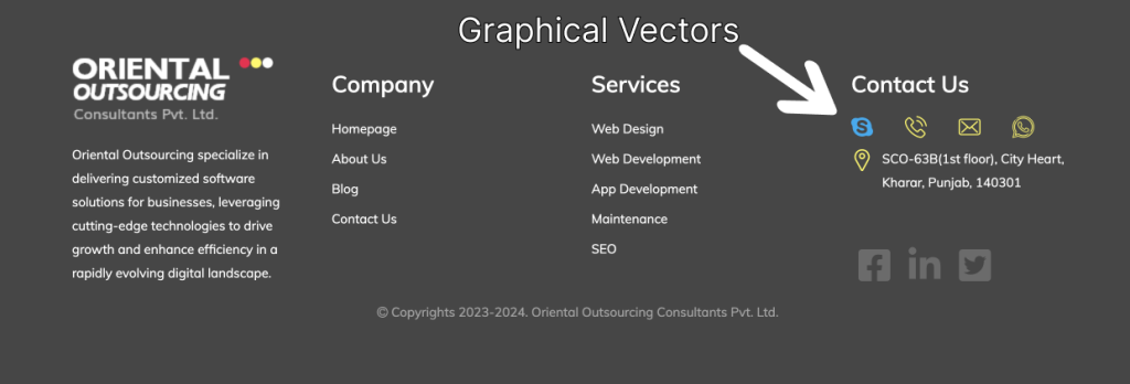
Many people think that footers are of block type. For visual interest add logos or graphical elements. Do not overload the small space with too many elements. Include icons such as “Follow me on Facebook/Twitter/whatever,”. Maps or phone numbers are small icon elements that can be included.

Thinking Small

A lot of small items can be included in the footer. Do not go for elements that are difficult to see with the naked eye. The footer elements can be too small elements to the body elements. Choose the items and icons which are readable in size. The purpose of the footer may not be served if the elements are too small or too close to each other.

Using Plenty Of Space

Due to spacing limitations, space and spacing are very important in footers. In between the elements of the footer leave adequate room for movement. For a clear view of the footer area adequate spacing is required. Most of the items in the footer are linked to one another.

Underline Only Important Links

The biggest mistake that is made while creating footers is that underlining the links. It is not necessary to underline all the links. The technique of underlining the links is an outdated technique that doesn’t apply in modern web designing.

Considering a Sub Footer

For creating a hierarchy and adding dimension to the footer space or just providing a fun content space, we can use a sub footer. It is a popular practice for adding sub footers for additional layering. We can insert a call to action or add high accolades to the sub footer for better traffic engagement.

So, these were the important points to keep in mind when it comes to footers while designing a website. Do let us know how they were useful for you.